


The Impact of Orange in Abstract Art
- Jacqueline Hurley
- Nov 18, 2025
- 4 min read

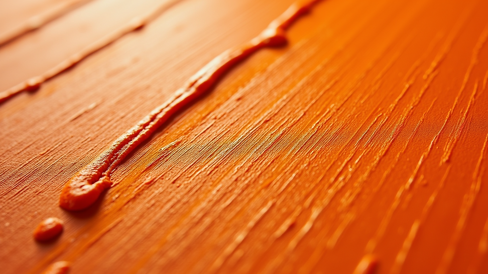
When I first started exploring abstract art, I was immediately drawn to the vibrant energy of orange. It’s a colour that commands attention without overwhelming the senses. Orange-toned abstract art has this unique ability to evoke warmth, creativity, and a sense of movement all at once. Have you ever noticed how a splash of orange can transform a room or a canvas? It’s like the colour breathes life into the space, inviting you to feel something deeper.
Let’s dive into why orange holds such a powerful place in abstract art and how it can influence your perception and environment.
Why Orange-Toned Abstract Art Captivates Us
Orange is a fascinating colour psychologically and artistically. It sits between red and yellow on the colour spectrum, combining the passion of red with the cheerfulness of yellow. This blend creates a dynamic, energetic vibe that’s hard to ignore.
In abstract art, orange often symbolizes:
Creativity and enthusiasm
Warmth and comfort
Vitality and movement
When artists use orange tones, they’re not just adding colour; they’re injecting emotion and energy. I find that orange-toned abstract art can make a space feel more inviting and alive. It’s no wonder interior designers often recommend it for living rooms or creative spaces.
Imagine walking into a room where a large canvas bursts with swirling oranges and subtle hints of reds and yellows. The energy is palpable. It’s like the art is speaking directly to your senses, encouraging you to engage and feel inspired.

The Role of Orange in Colour Theory and Abstract Art
Understanding colour theory helps us appreciate why orange is so impactful in abstract art. Orange is a warm colour, and warm colours tend to advance visually, meaning they appear closer to the viewer. This quality makes orange perfect for creating focal points in abstract compositions.
In abstract art, where form and structure are often ambiguous, colour becomes the primary tool for communication. Orange can:
Draw the eye immediately
Create a sense of depth and layering
Balance cooler tones like blues and greens
I’ve noticed that when orange is paired with contrasting colours, it intensifies the overall effect. For example, a splash of bright orange against a deep blue background creates a striking visual tension that’s both exciting and harmonious.
If you’re considering adding abstract art to your collection or space, think about how orange tones might interact with your existing colour palette. It’s a bold choice, but one that can pay off beautifully.
Exploring the Emotional Power of Orange in Abstract Art
Have you ever felt a sudden rush of energy or warmth when looking at a piece of art? That’s often the emotional power of colour at work. Orange, in particular, has a way of stirring feelings of joy, optimism, and even nostalgia.
In abstract art, where the subject is often open to interpretation, colour becomes the emotional anchor. Orange can evoke:
The glow of a sunset
The warmth of a crackling fire
The zest of fresh citrus fruits
These associations are deeply ingrained in our minds, making orange a colour that resonates on a personal level. When I view orange abstract art, I’m reminded of moments filled with warmth and vitality. It’s a colour that invites you to pause and feel.
For collectors and interior designers, this emotional connection is invaluable. Art that stirs feeling can transform a space from merely decorative to truly meaningful.
How to Incorporate Orange-Toned Abstract Art into Your Space
If you’re thinking about adding orange-toned abstract art to your home or office, here are some practical tips to make the most of this vibrant colour:
Choose the right size
Large pieces with bold orange tones can become the room’s focal point. Smaller pieces work well as accents or in gallery walls.
Consider lighting
Orange looks stunning under warm lighting. Avoid harsh, cold lights that can dull its vibrancy.
Balance with neutrals
Pair orange art with neutral walls and furniture to let the artwork shine without overwhelming the space.
Mix with complementary colours
Blues and greens complement orange beautifully. Use cushions, rugs, or accessories in these colours to create harmony.
Think about mood
Orange energises, so it’s perfect for creative spaces, living rooms, or areas where you want to encourage conversation and activity.
Personally, I love how a single piece of orange-toned abstract art can change the entire feel of a room. It’s like adding a burst of sunshine indoors.
The Unique Appeal of Orange in Jacqueline Zoffany’s Work
Jacqueline Zoffany’s abstract pieces are a brilliant example of how orange can be used to evoke emotion and movement. Her work often features rich, layered orange tones that seem to pulse with life. What sets her art apart is the balance she strikes between boldness and subtlety.
Her pieces invite you to explore the nuances of orange - from fiery, intense hues to soft, glowing shades. This range makes her art versatile for different settings and moods.
If you’re looking to invest in art that’s both visually striking and emotionally resonant, exploring Jacqueline’s collection of orange abstract art is a great place to start. Whether you prefer prints or commissions, her work offers something truly special.
Bringing Warmth and Energy to Your Collection
In the end, orange-toned abstract art is more than just a colour choice. It’s a statement. It says you’re not afraid to embrace warmth, creativity, and vitality in your space. It’s a colour that invites you to feel deeply and live vibrantly.
If you want your art collection or interior design to reflect energy and emotion, orange is a fantastic colour to explore. It’s bold, it’s beautiful, and it’s endlessly inspiring.
So, why not add a splash of orange to your world? You might just find it changes the way you see and feel your surroundings.
I hope this exploration of orange in abstract art has sparked some ideas for you. Whether you’re an art collector, a designer, or simply someone who loves colour, orange offers a world of possibilities. Dive in and let your space glow with the warmth and energy of orange-toned abstract art.


Comments